Arellano Global's brand flagship website — built on a comprehensive Radix UI component library, shadcn/ui design system, and a bidirectional AI-assisted design workflow that keeps code and design in sync.
Building a brand flagship isn't a design problem — it's an architecture problem. The first version of any marketing site is hand-crafted and looks exactly as designed. The problem surfaces six weeks later when a dropdown needs a keyboard accessibility fix, a dialog needs an animation update, and a tooltip needs to work on mobile without any of those changes affecting the other two.
Component libraries exist precisely to solve this. But most teams treat component libraries as a collection of styled elements rather than a behavioral contract. Radix UI's primitives are different: they provide the accessibility tree, keyboard navigation, focus management, and screen reader semantics as a baseline — and let you own the styling entirely. That's the foundation this site needed.
The secondary constraint was iteration velocity. The agency's design workflow needed to stay in sync with code. Rather than the traditional handoff loop (design → review → implementation → QA → repeat), the build uses Lovable.dev for bidirectional sync: AI-generated design changes flow into the repository, and code changes push back. The result is a design workflow that eliminates the handoff gap entirely.
The site also needed to be bilingual from the start — not translated after the fact. Every piece of copy lives in structured i18next locale files. Language switching is instant, with no page reload and no layout reflow. Lenis smooth scroll wraps the entire page for the tactile scroll feel that distinguishes premium sites from standard ones.

ABOUT — HERO SECTION
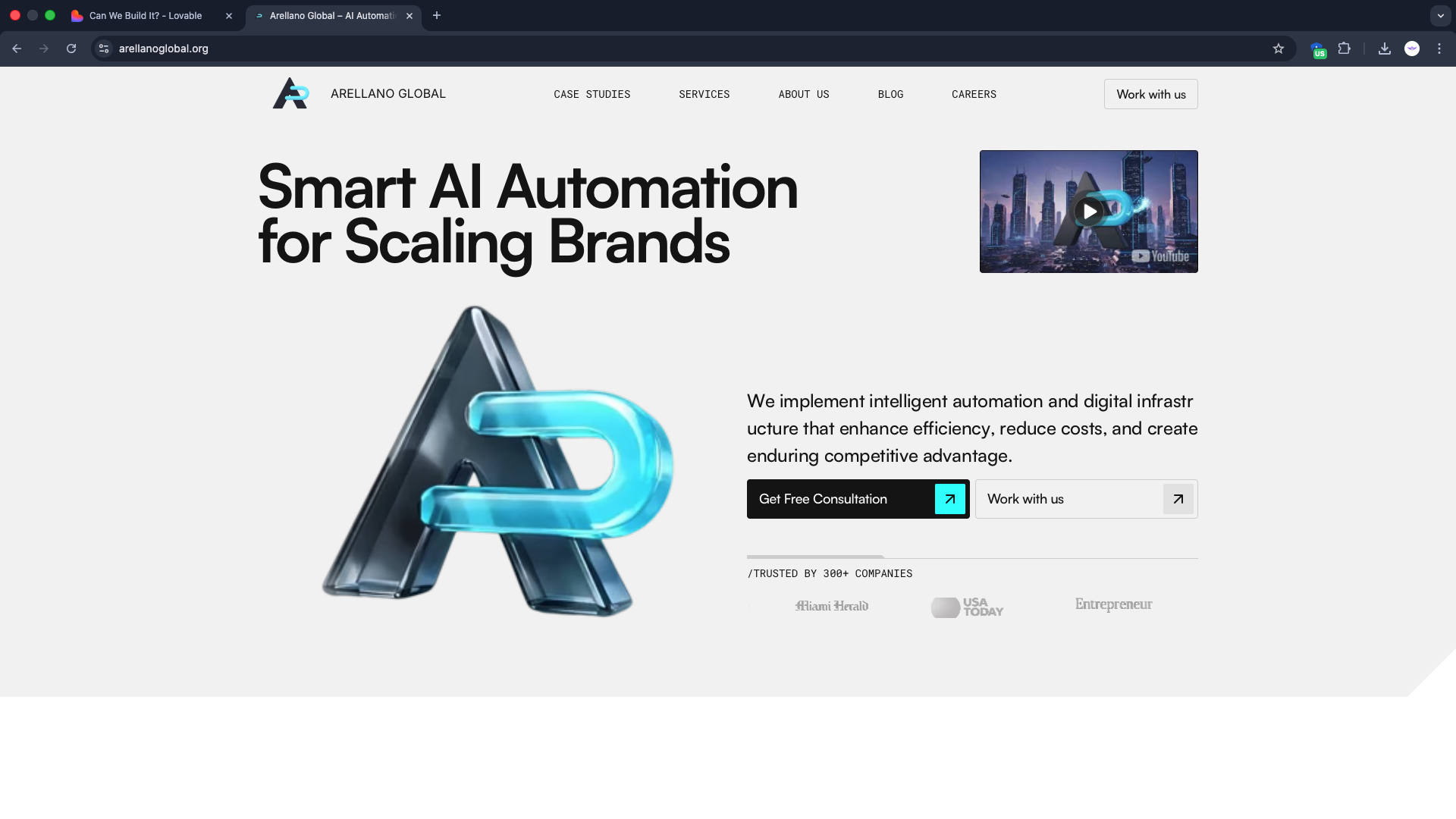
HERO — arellanoglobal.org
CASE STUDY SECTION

OUR STORY — arellanoglobal.org
Three layers working together: a design system that enforces consistency, a component library that guarantees accessibility, and an AI-assisted workflow that keeps design and implementation in sync.
"Radix UI gives you the behavior contract. shadcn/ui gives you the styling contract. Together, they make consistency a structural property of the codebase."
All UI components are built on the shadcn/ui pattern: copy-owned components
that live in src/components/ui/ and are never imported from a
registry at runtime. Tailwind CSS variables define the design token layer.
Modifying a button's border-radius or a card's shadow updates every instance
site-wide from a single change in globals.css.
Every interactive element — dropdown menus, dialogs, accordion sections, tabs, tooltips, radio groups, select menus, sliders, toast notifications — is backed by a Radix UI primitive. Radix handles the WAI-ARIA roles, keyboard navigation, focus trapping, and screen reader announcements. The implementation layer handles only visual styling. This separation means accessibility fixes happen upstream in Radix and flow down automatically.
The site uses Lovable.dev as a design acceleration layer. Design changes initiated in Lovable's AI interface generate React component code that is committed directly to the repository. Code changes made in the IDE push back to Lovable's canvas. This bidirectional sync eliminates the traditional design-handoff gap: there is no Figma → developer translation step, no "make it look like the mockup" QA pass, and no drift between what was designed and what shipped. The AI generates components that conform to the existing shadcn/ui system — it knows the token names, the utility class patterns, and the component API shapes. Updates land in the repository as normal commits, visible in git history, reviewable in PRs.
Lenis wraps the entire page scroll context. The result is the inertia-based
momentum scroll that distinguishes premium web experiences from standard
browser scroll. Lenis's lerp parameter controls the smoothing
factor — set to 0.1 for a natural deceleration that doesn't feel
sluggish at low values.
Contact and intake forms use react-hook-form for uncontrolled
input management — zero re-renders on keystrokes until validation
runs. Schema validation is handled by Zod. The Zod schema is the single
source of truth for both client-side validation error messages and TypeScript
types — z.infer<typeof schema> eliminates the type
duplication that comes from maintaining separate interface definitions.
Data visualization for service metrics uses recharts, which
integrates cleanly with Radix's composition model.
Left: component hierarchy — Radix primitives as behavioral base, shadcn/ui as styling layer, Lovable.dev as sync layer. Right: i18next bilingual architecture and Lenis scroll.
A brand flagship built on a component library that makes consistency structural, accessibility non-optional, and design iteration fast.
Every interactive component on the site has correct WAI-ARIA roles, keyboard navigation, and focus management because those behaviors are inherited from Radix primitives — not implemented case by case. A new dropdown is accessible by default before a single line of styling is written. Screen reader announcements, focus trapping in dialogs, roving tabindex in radio groups — all handled upstream. This is the compounding return on choosing primitives over a pre-styled component library.
The Lovable.dev bidirectional sync eliminates the design-to-dev handoff entirely. A design change that would take 2 days under a traditional Figma workflow — design update → developer implementation → QA → sign-off — takes hours when the AI generates the component code directly into the repository.
Zod schemas serve as the single source of truth for validation logic and
TypeScript types simultaneously. z.infer<typeof contactSchema>
eliminates the maintenance burden of keeping a separate interface in sync
with validation rules — they are provably identical by construction.
shadcn/ui + Radix UI component showcase: Accordion with keyboard nav, Tabs, Dialog with focus trapping, DropdownMenu, react-hook-form with Zod validation errors, and recharts data visualization
Accessible-by-default UI engineering with Radix primitives, shadcn/ui, and a design workflow that ships.
View All Work →